Discovery Mall
Elegance. Cozy. Inspiration
About the project
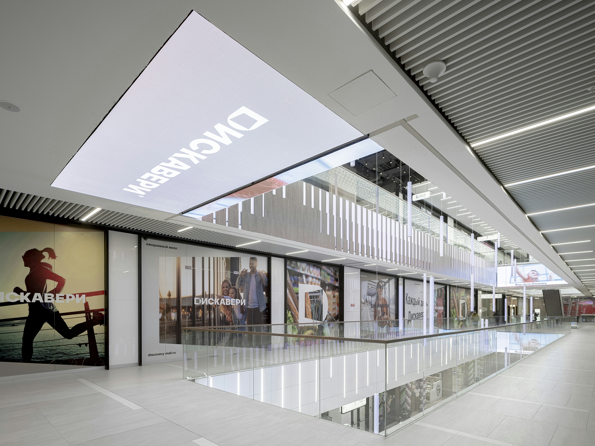
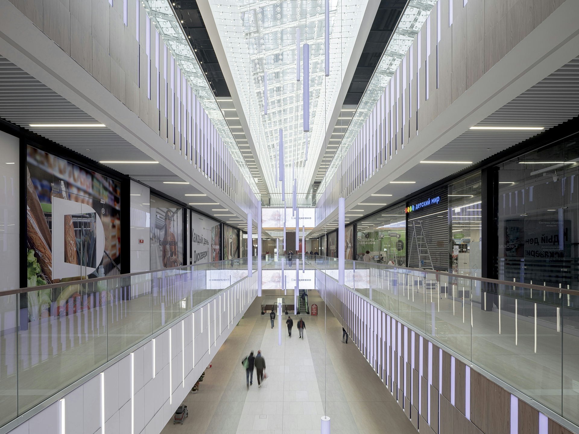
Blank Architects designed a multifunctional retail center for the Discovery complex. The Discovery Residential Complex is a new MR Group project. Discovery is made for those who appreciate a green environment: these five buildings up to 31 floors high will be located in the “ecological triangle” — between Khimki Forest Park and Druzhba and Grachevsky Parks.
Concept
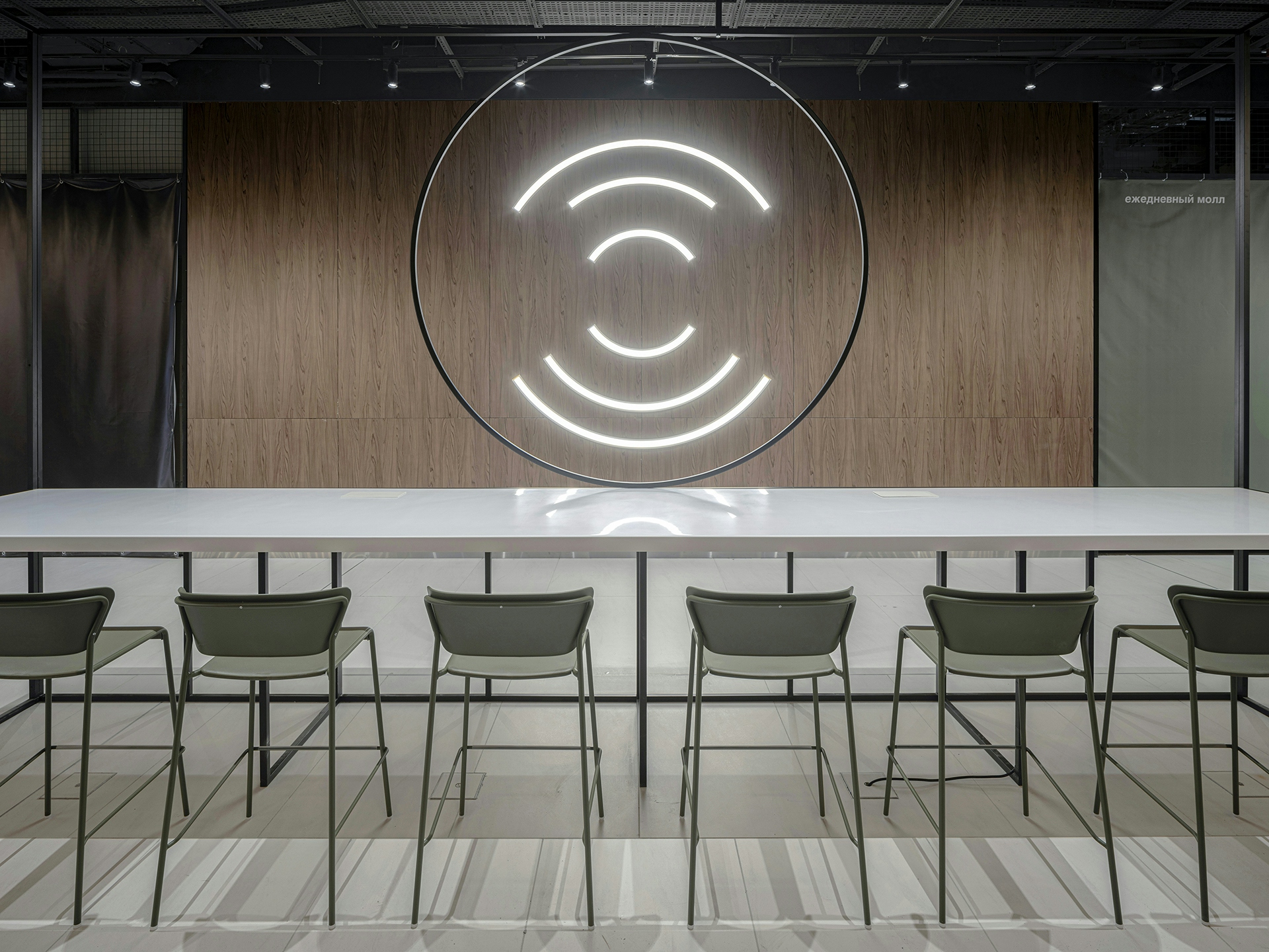
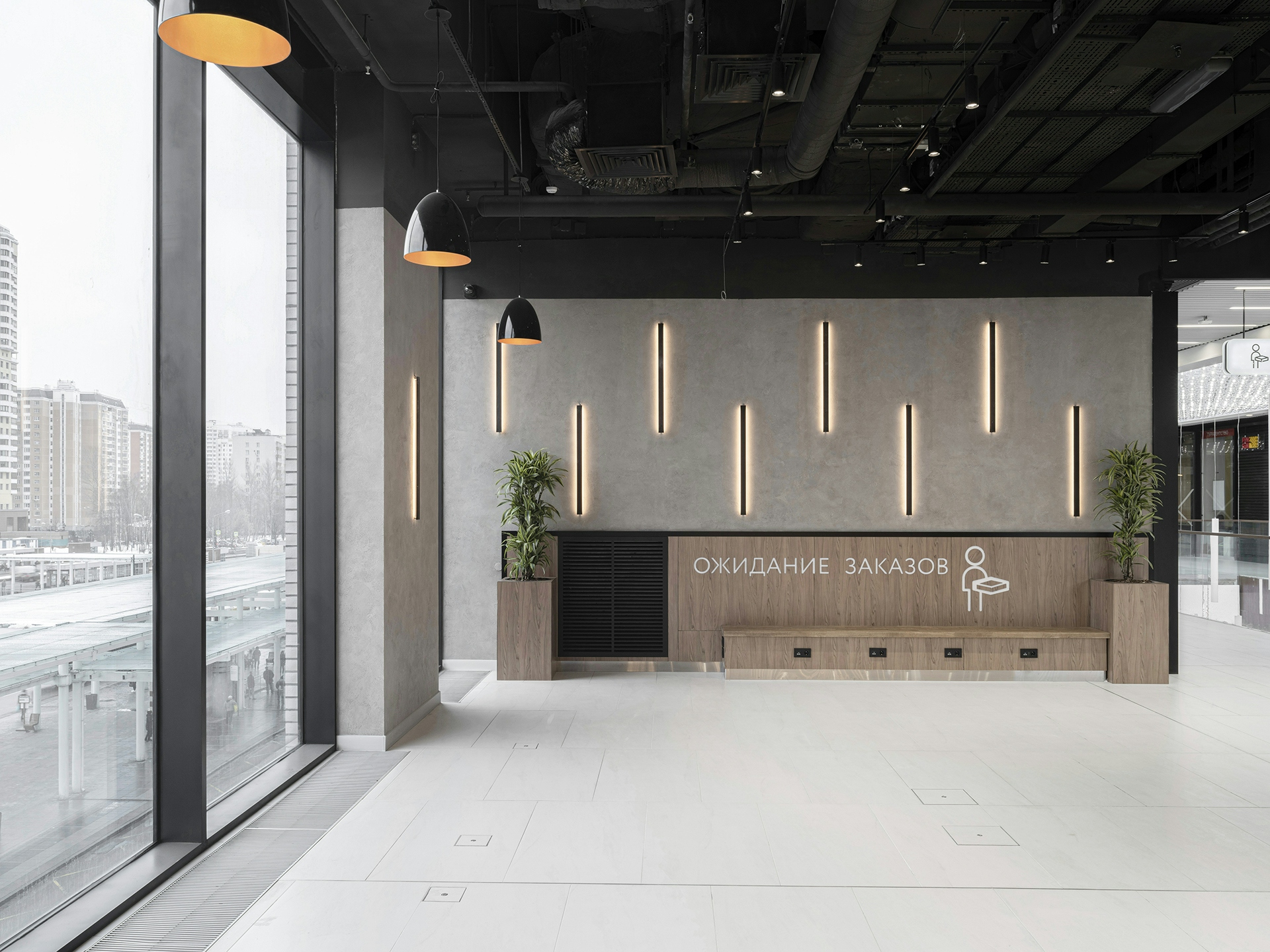
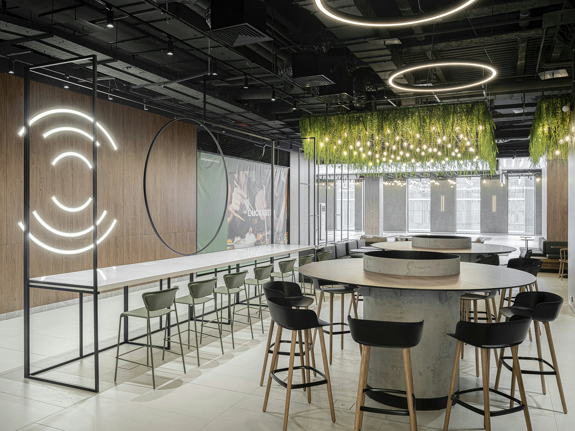
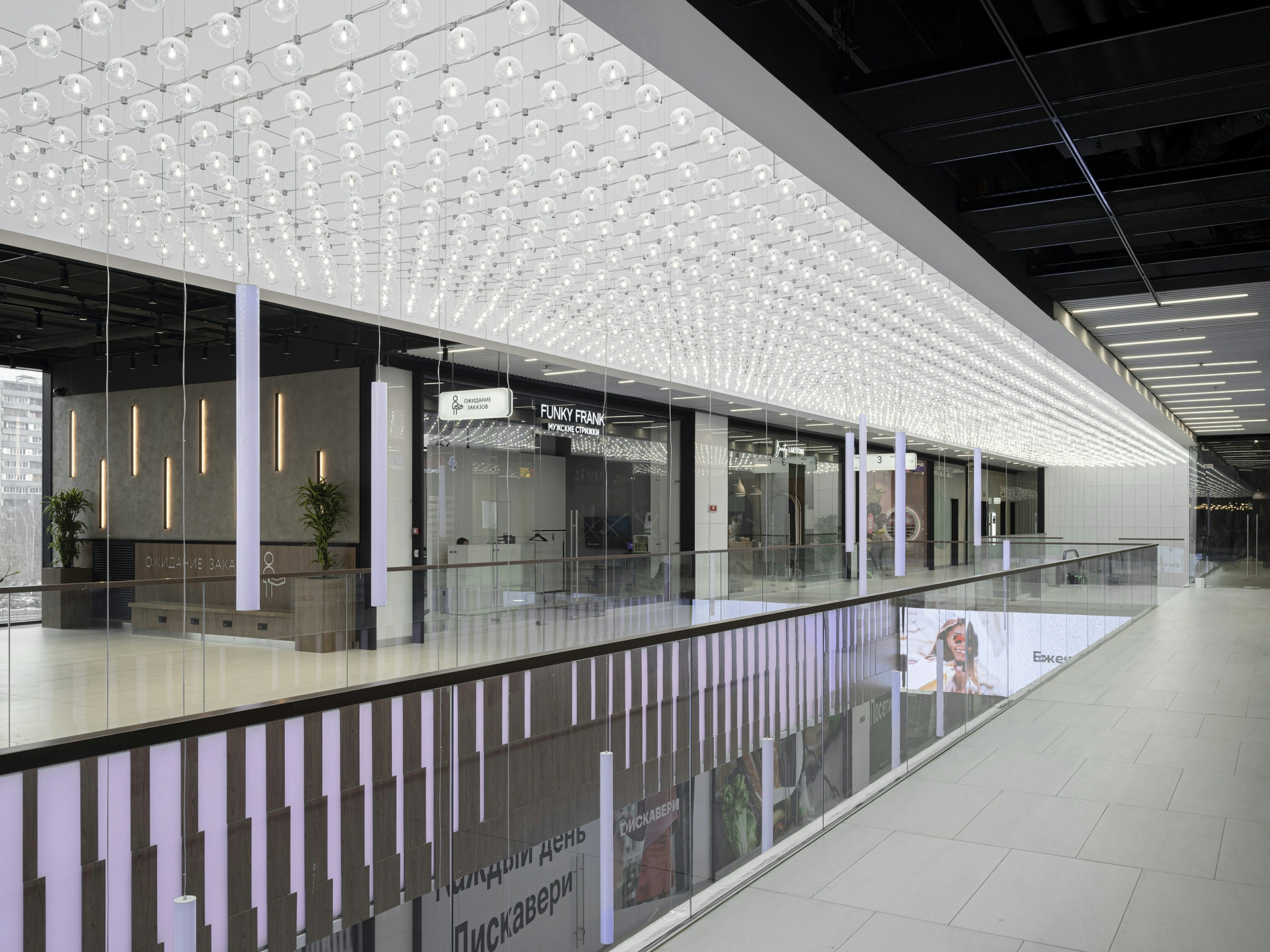
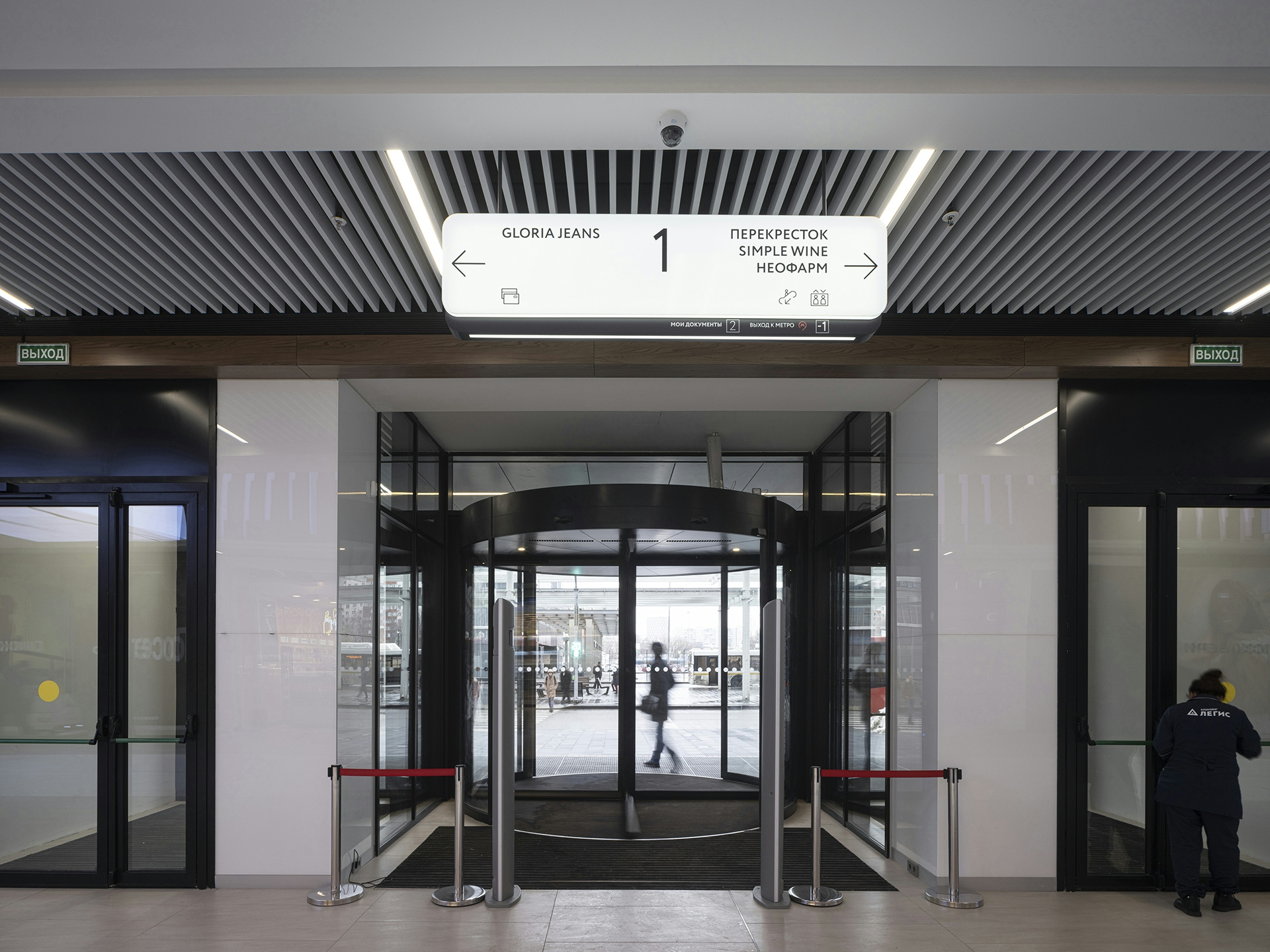
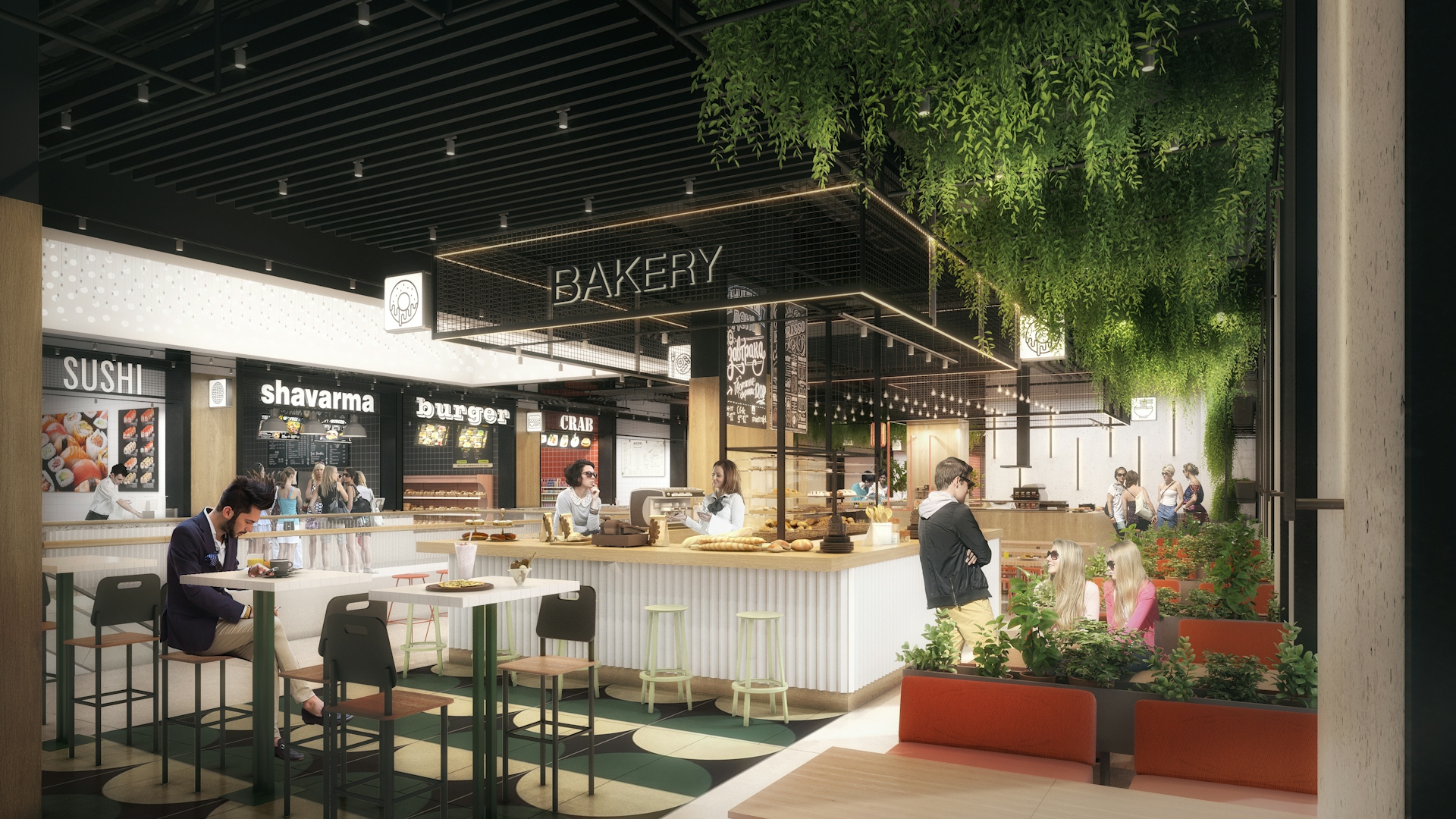
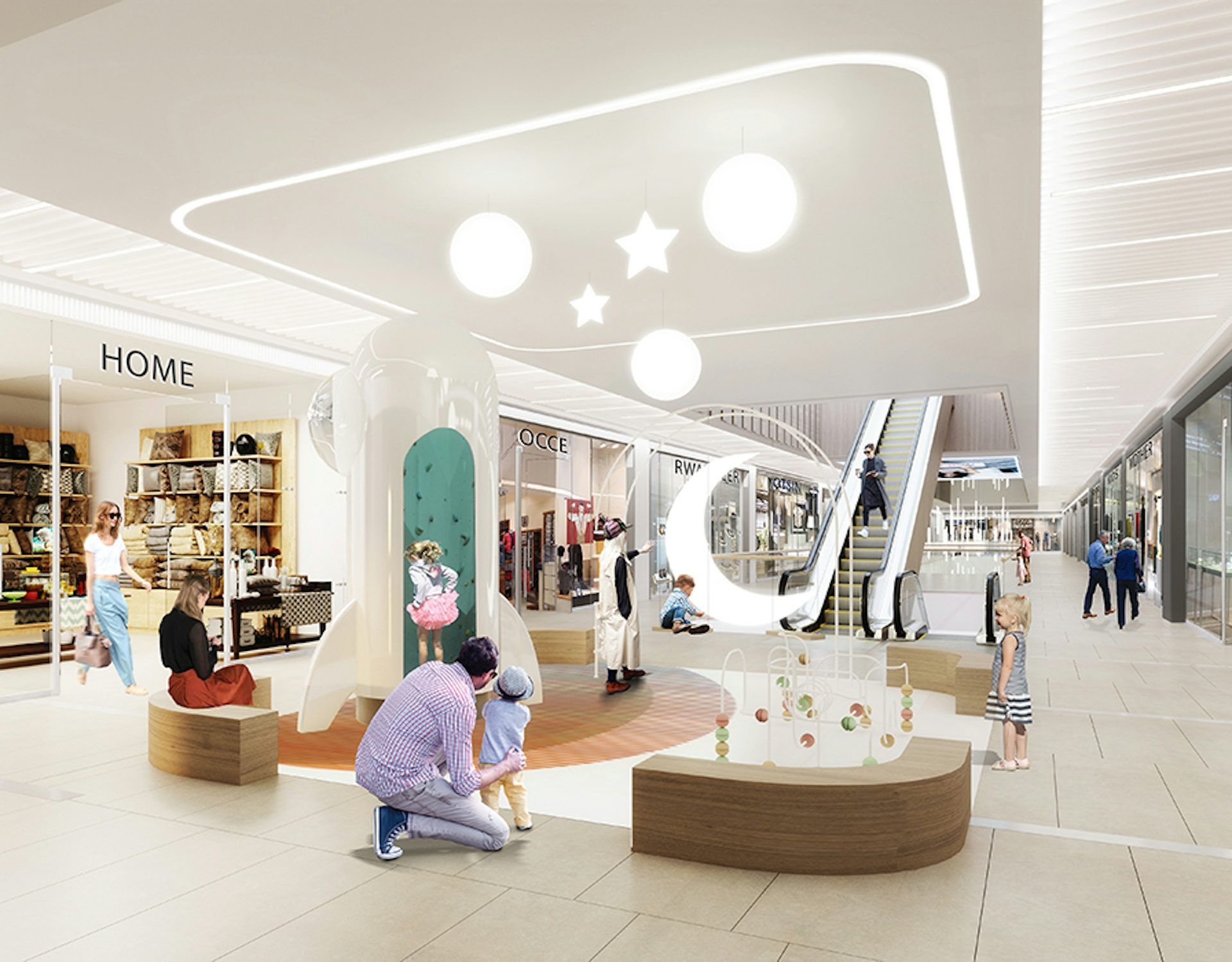
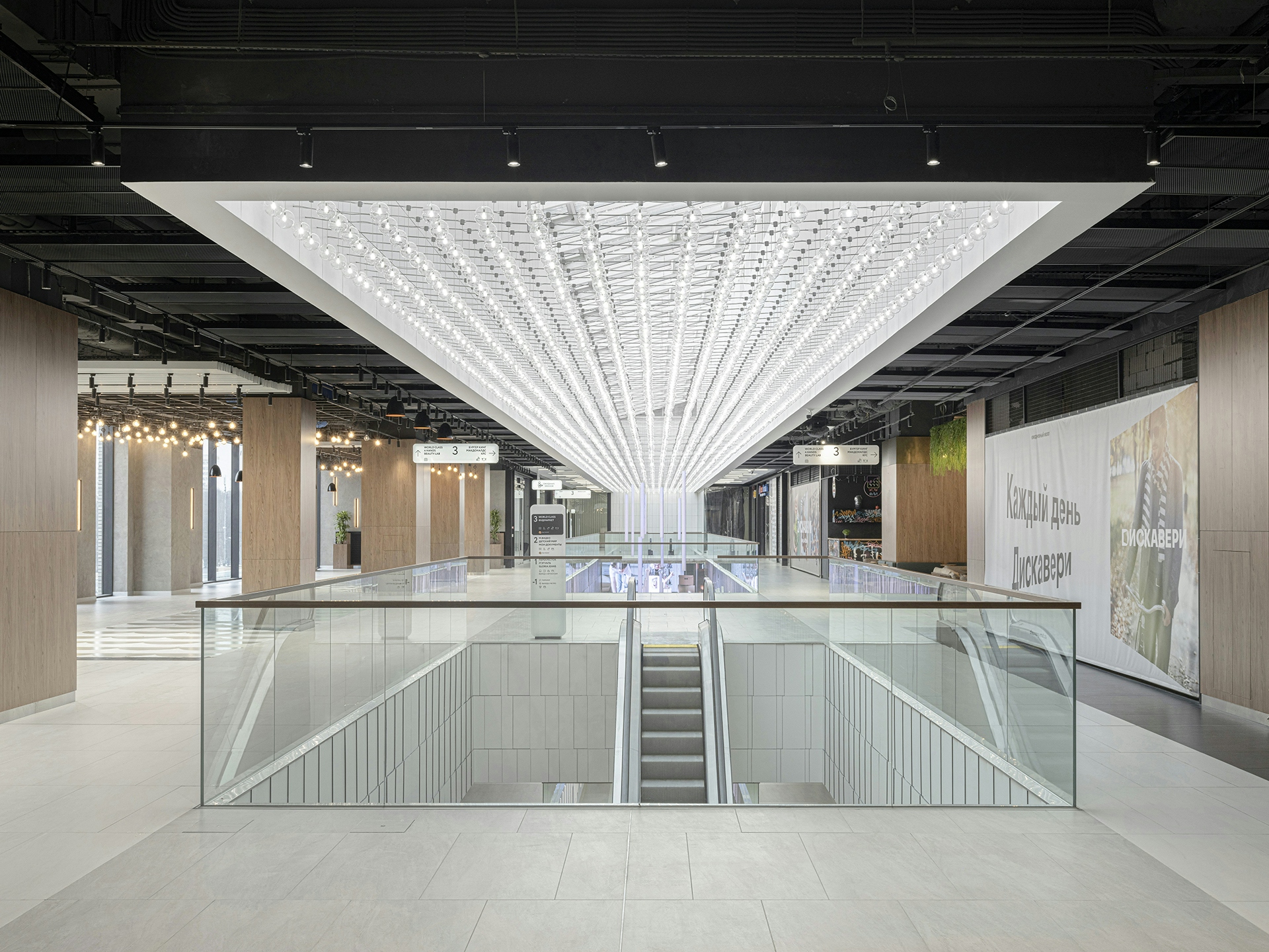
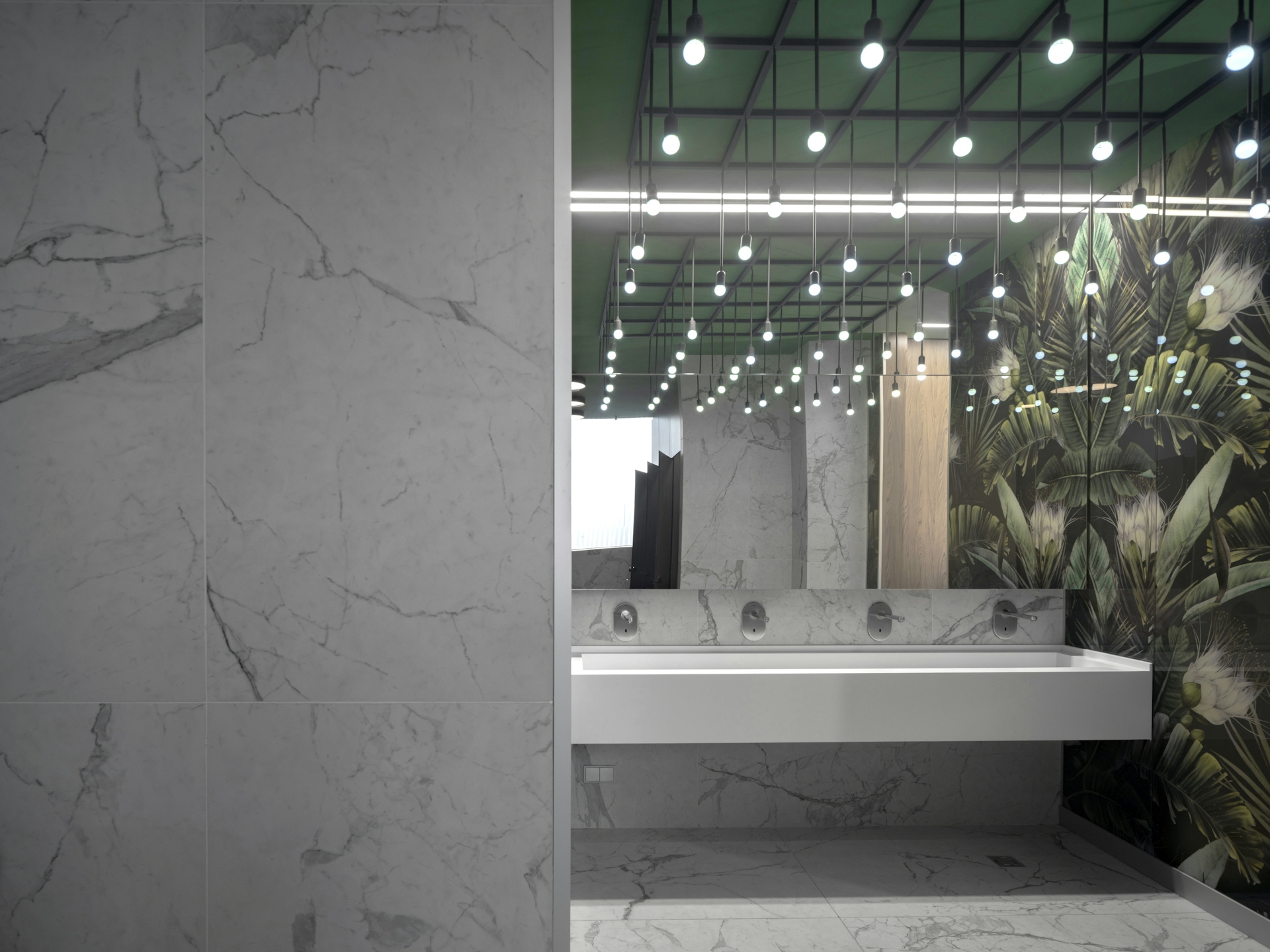
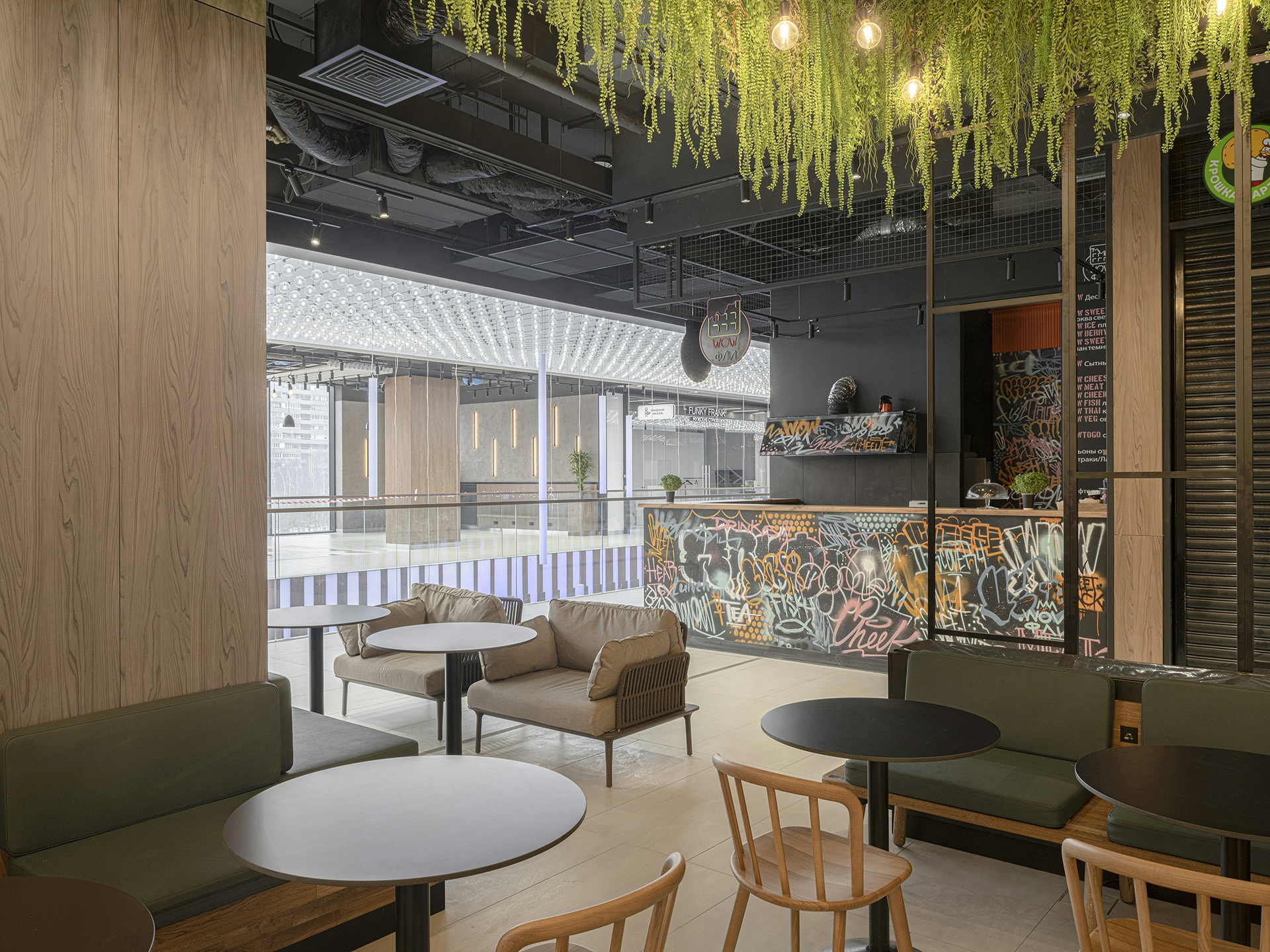
Every minute, myriads of stars come into the world and disappear. If you look closely into the heavens, you can find your own sky. This concept develops the idea of residential areas. We imagined a strict, somewhat restrained, yet cozy and warm space. The interior design is inspired by a starfall. The lighting and the art-installation in the atrium penetrate the space vertically like a spacefall, interlinking the floors of the shopping mall. The inviting, cozy interior consists of bright white and honey-like tones.
Wayfinding
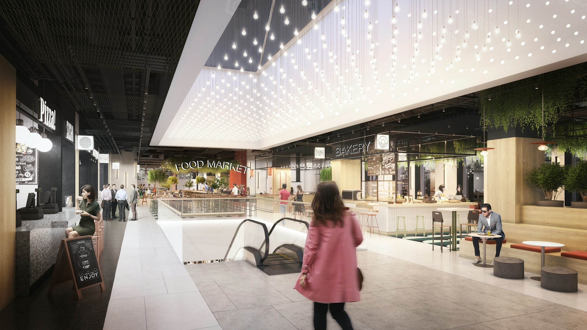
For convenience of orientation in the space of the floor and the intuitiveness of the search for a parking space, we propose to divide each floor of the parking into 4 blocks — A, B, C, D. Each block will be identified by the color of the floor/zone, the letter symbol of the block and the range of places, that follow the direction of travel. Parking space numbers are indicated on a contrasting band, painted in the color of the corresponding zone. For the intuitive orientation of pedestrians from parking spaces to the entrances to the towers of the residential complex, wall charts are used to indicate the direction of movement towards the towers in accordance with their names. Directions of movement to the towers and the shopping center are indicated by floor graphics in the form of pedestrian paths, in which signs are embedded, with the names of the towers, the shopping center and arrows. A pedestrian walkway from the corresponding carpark block leads to the mall entrance. Wall graphics assist with the identification of the entrance from afar. The color scheme echoes the design of the columns in the parking zone for visitors to the shopping center, which intuitively connects them to each other. The building is located near the transport hub as part of the metro station, the MCC and the largest bus station. Such a location predetermined the need to work out navigation, focused both on the target visitors of the shopping center living in a residential complex, and on transit flows. For the comfort of all the guests, we have provided the space with service information about the exits to certain buses, to the metro station, to the parking lot and to the key services of the shopping center itself. The result is an extremely intuitive, concise and at the same time it's a detailed information system.


Realization
The internal wayfinding symbols are perfectly integrated into the interiors of the object. at the same time, thanks to multimedia formats, lighting, correctly selected fonts and iconography, visitors will see the necessary information exactly where they need it. As part of the project to update the appearance of the shopping center, our task was also to create wayfinding elements on the facade of the object from the side of the Altufyevsky highway. For this task, we used the corner of the facade, where we added bright elements and light boxes indicating the direction of movement to the shopping center. We have placed a wayfinding totem on the ring and created a landscape design that will become the hallmark of the shopping center. We have harmoniously integrated the new wayfinding elements in the interiors into architectural solutions, while not violating the idea of easy readability of signs and information.
